Broward County Government
My Role
As senior designer and front-end developer for Broward County government, I had the unique privilege of identifying problems and working on solutions that directly impacted the nearly 2 million people that make up the diverse local community and the subset of them who worked for Broward County, whether using the internet or intranet sites.
Defining the problem
Public service websites are typically not known for delivering delightful user experiences to the people they serve - but what if I could help make ones that were? Positively impacting the people who use the websites and by extension the positive impact that would have on the larger community is my "why".
Everyone is upset and everything is broken
One of the good (and bad) things about fixing a public service website is that there is no lack of incoming data to evaluate. From complaint emails to surveys to website analytics to search queries. With these and more streams of information available, it can quickly become overwhelming unless there is a method to clarify and prioritize problems to solve.
In order to accomplish this (the "how"), we needed to understand the "who" and "what" better. The "who" are real people and the what is their experience with a product. Finding out more about the people and their experience with the product would give us a better shot at finding out how we can work on making it more useful, delightful and, dare I say, beautiful.
Who are the people?
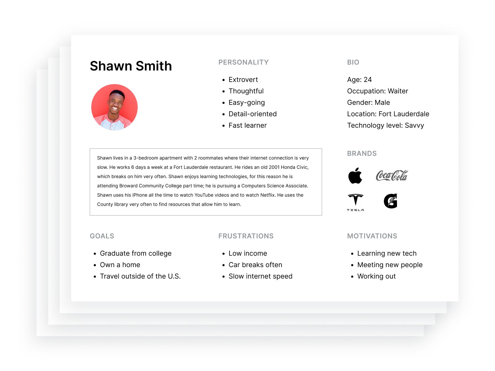
By evaluating local census data, site analytics, survey responses and other glimpses into who our users were, we were able to create some personas to bring our people to life.

How do they experience our product?
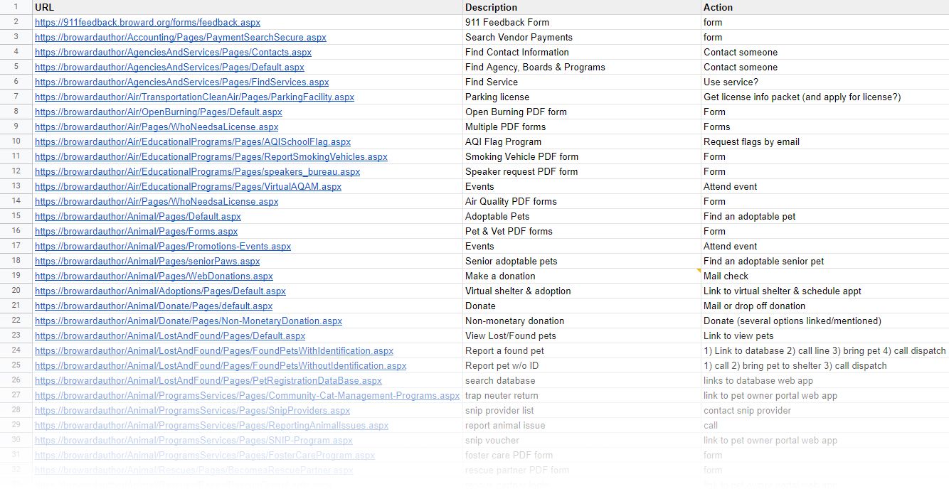
Finding out what they do took the form of a detailed review of pages on the site listing actionable tasks which could later be sorted by cross-checking with analytics.

After sifting through these various forms of aforementioned information, a few clear signals emerged from the noise. The clearest one was some variation of: "I can't find anything!"* So the task that was the biggest pain point was the meta task of finding your way to the task you wanted to do.
How do you help people find things easier?
With the problem identified, the next question was: "how may we help users find what they're looking for easier?"

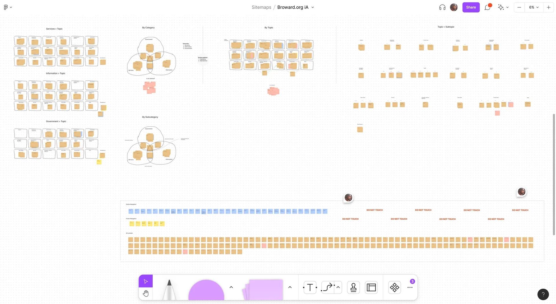
Taking a bird's eye view yielded the insight that everything on the site is is some form of information architecture - whether at a macro (site structure) or micro (interface design or writing) level.
Maybe observing how they perceive all the things will help?
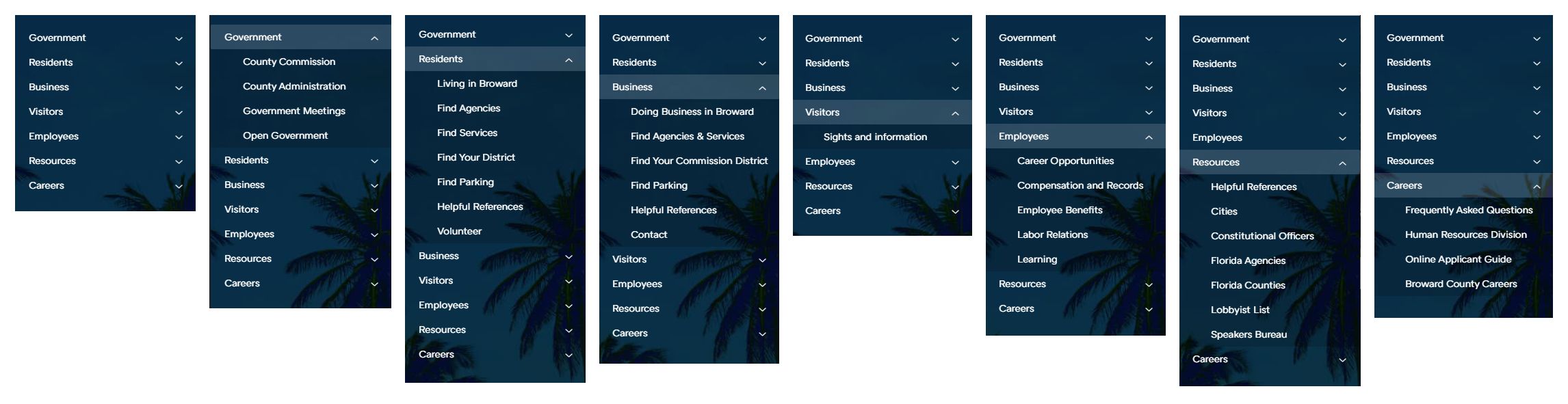
With this insight in mind, conducting a comprehensive evaluation of the site structure and interface design patterns seemed like a good starting place. The results revealed deep silos.

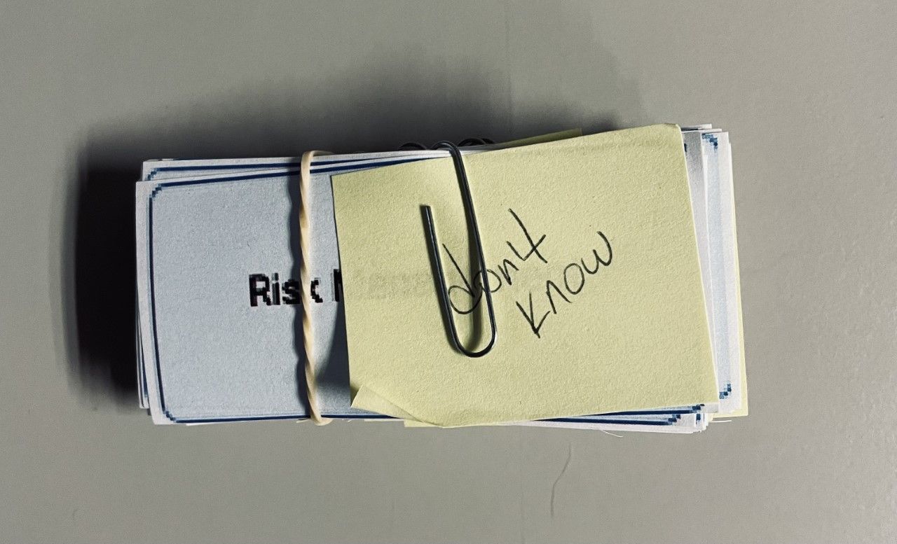
I conducted card sorting exercises with all of the site names and looked to secondary research with the hopes of patterns emerging.

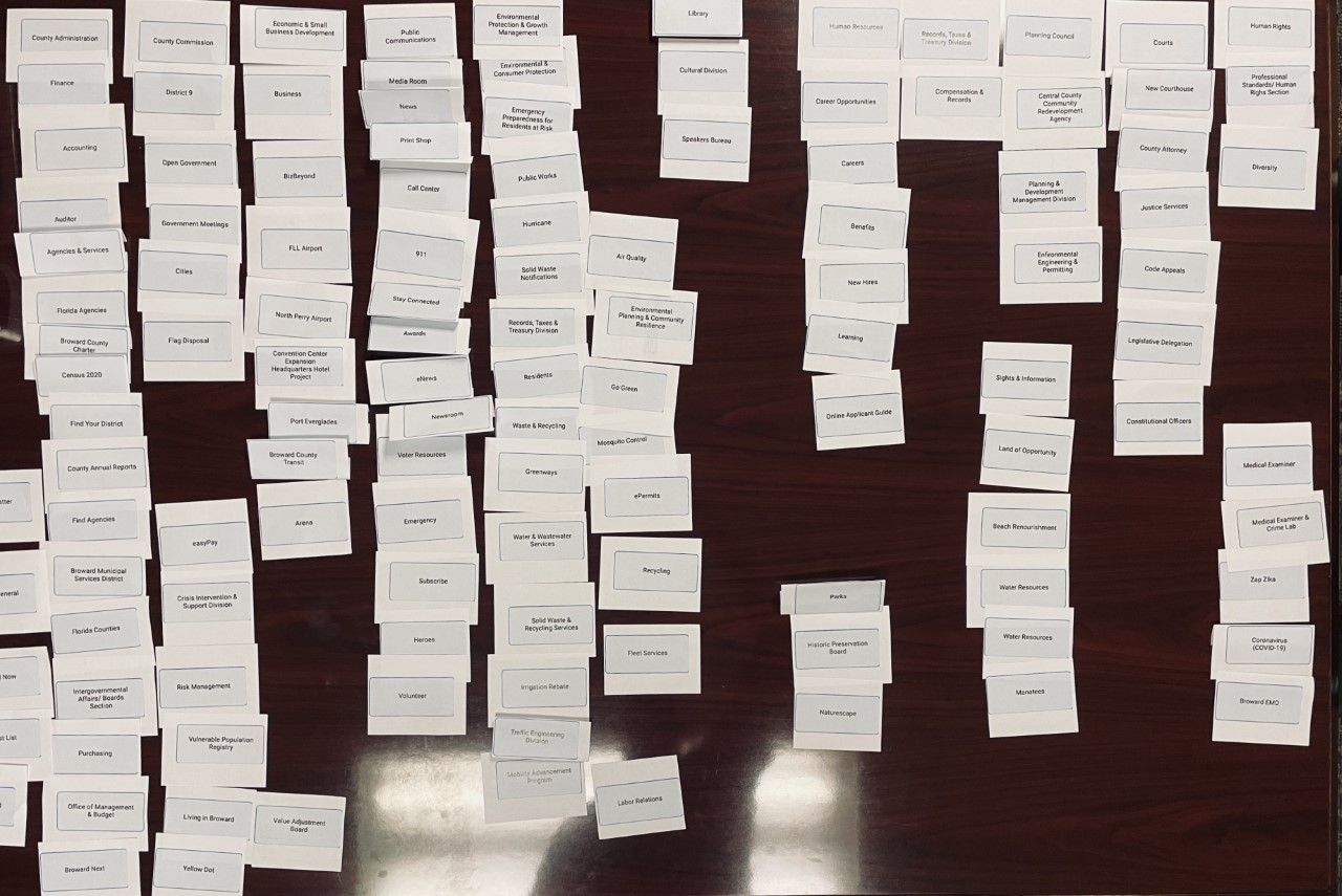
The most surprising findings from the card sorting exercise to me was the sheer amount of "I don't know what this means" responses to names and how uniquely each person seemed to organize the cards. I had expected organizational patterns to emerge but instead was confronted with what seemed to be very personal choices. This appeared to be the wrong path.

Maybe we just make it easy for them to find the one thing they need to do?
The re-realization dawned that it was a public service website and that people were coming to it to use those services. That was how I had used it as a citizen looking for a bus and I felt confident the data backed the first organizational step being based on how the content relates to what the user is looking to do. Secondary research backed this up both at a micro (Nielsen Norman) and macro level (SF.gov and NYC.gov).
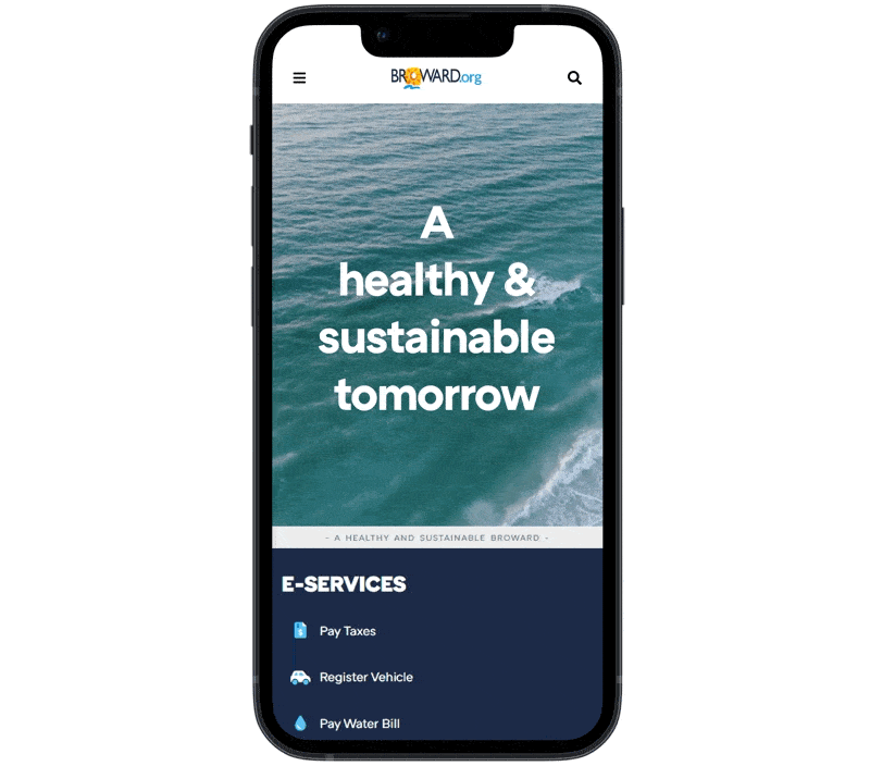
Designing and testing
I proceeded to create mockups and prototypes for user testing in Figma. These concepts were shown to key stakeholders and met with approval and user testing was set to begin.

I validated the possibility of building this new navigation using React in SharePoint as it seemed ideal for the data-driven nature of this component.
Iterating
Now that I am near the end of this study, I'd like to risk subverting my original premise by saying that while using terms like "problem" and "solution" are easier ideas to grasp, I think that since we are talking about digital products, pursuing an ideal like beauty (which will never be fully achieved) may be a better way of thinking of product design since we are able to iterate. New findings yield new hypotheses which lead to new designs which lead to new findings and the loop goes on.
Better tools for the builders
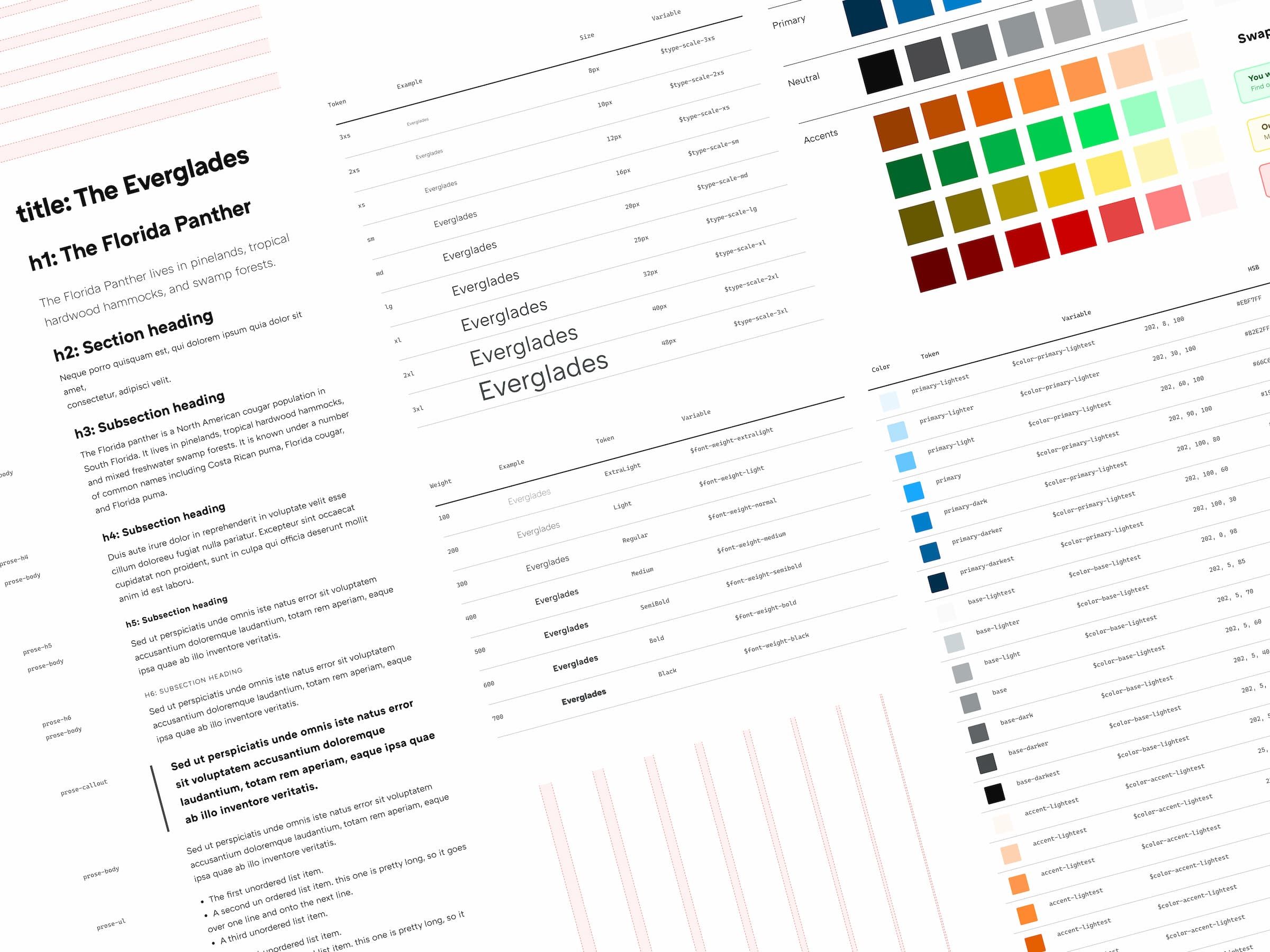
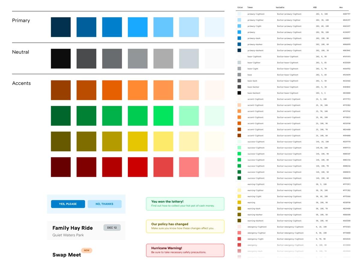
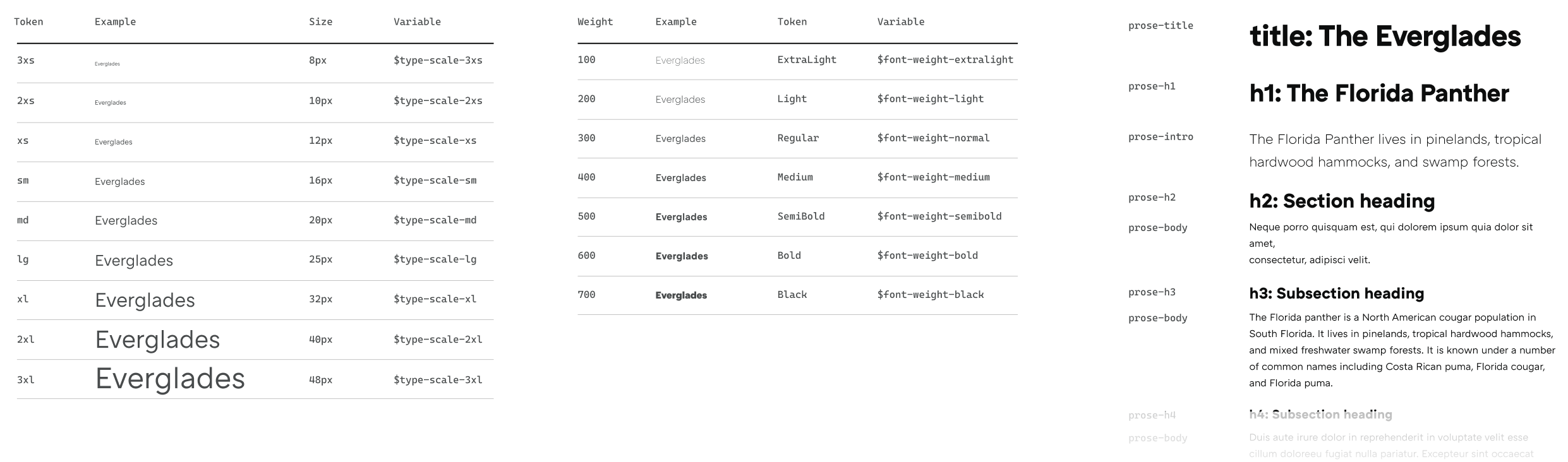
For designers, I created a unified accessible design system with variables that directly translate to CSS (Sass) styles.


For developers, I built modernized front-end development workflows that incorporated version control (Git/Gitflow) and automation (Gulp) in order to make building the site a better experience for everyone who would be working on it.

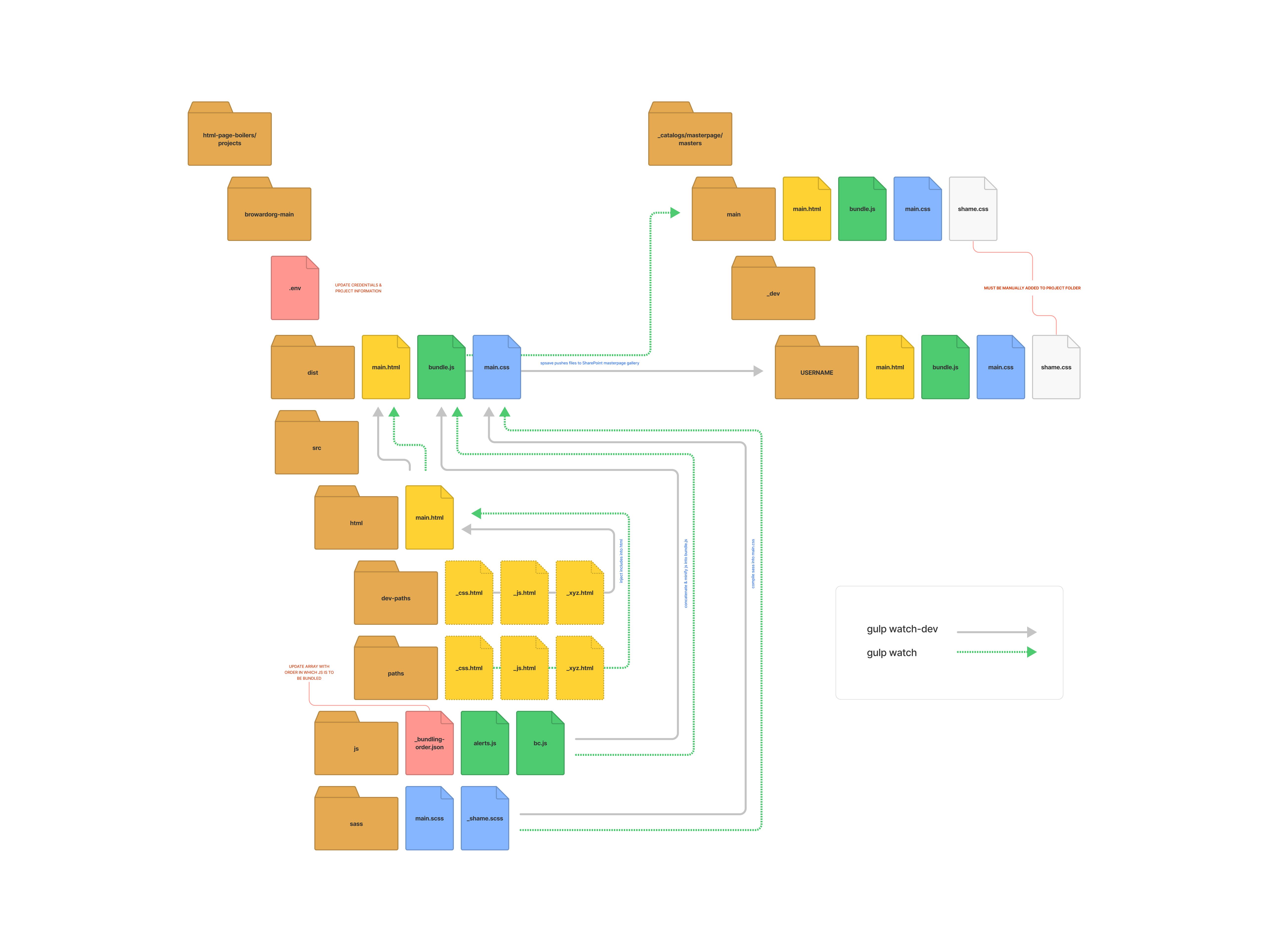

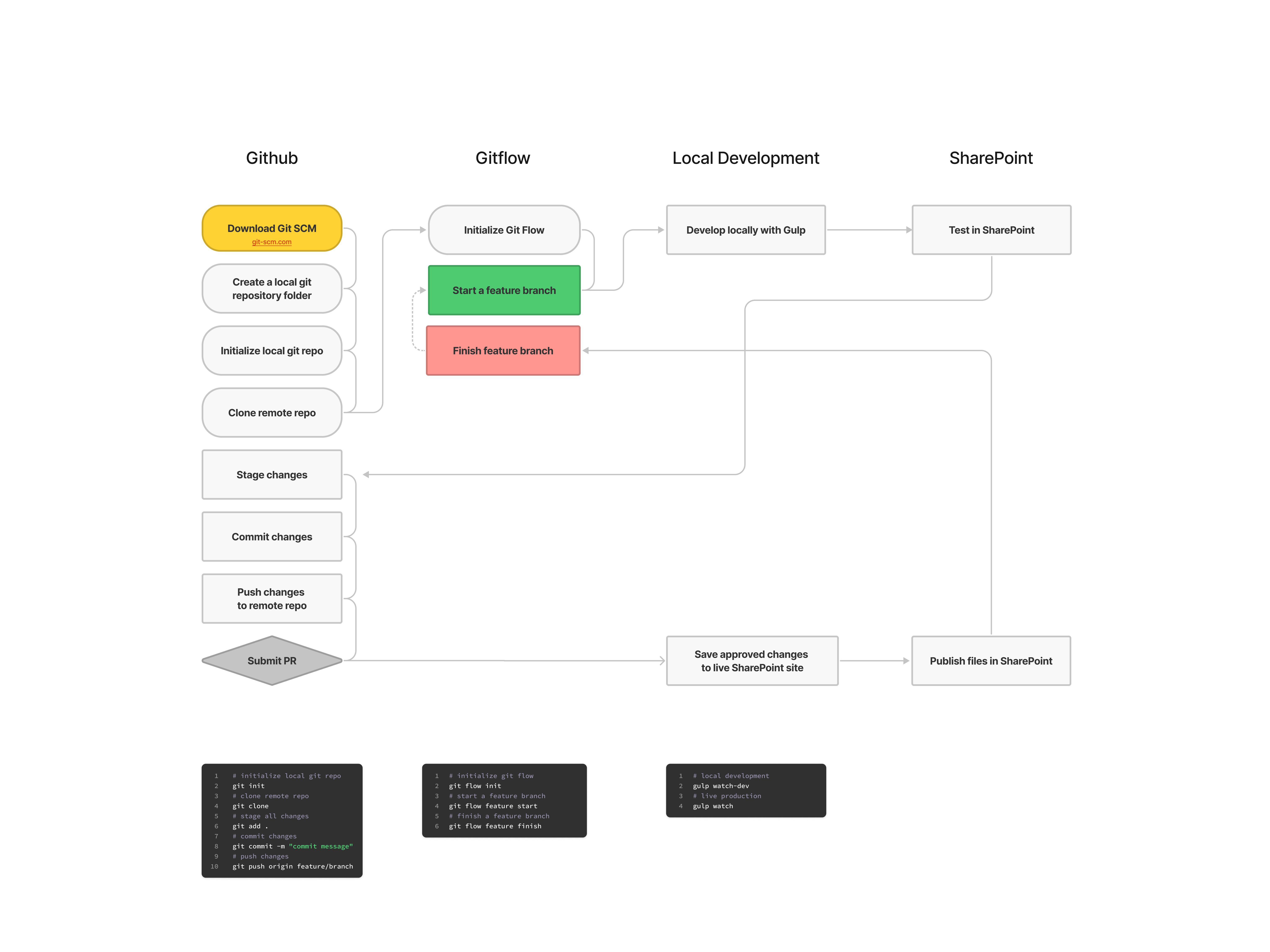
I wrote extensive documentation and taught developers in group and one-on-one sessions how to efficiently use these new tools.
Spreading the news
Since the content (and in some cases, site structure) is maintained by a decentralized network of editors, I developed a robust interactive training program (that I teach quarterly) to prospective website editors.

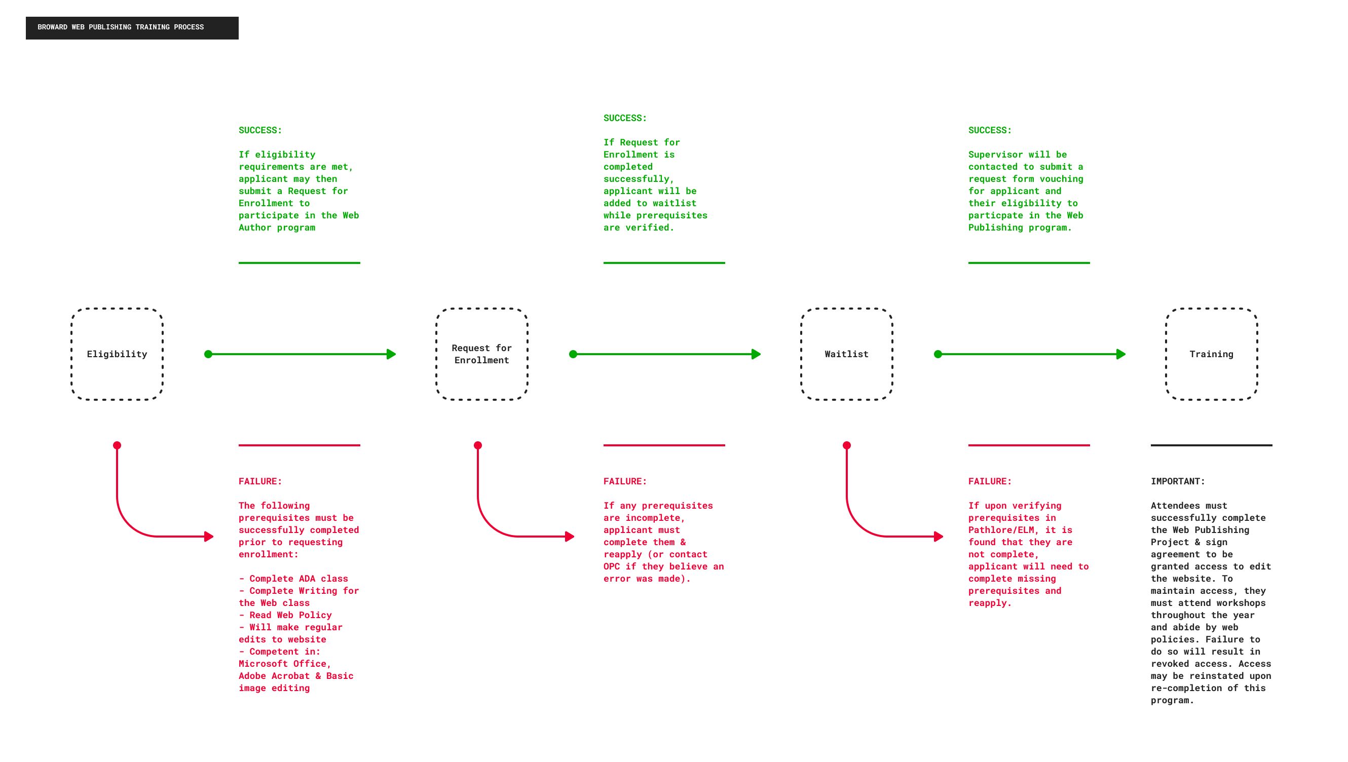
I've shared ongoing insights with the editors during these trainings and workshops and have been encouraged to see others applying empathy in their content creation.
Some other projects I've worked on at Broward County:
- Translation using Azure Cognitive Services API
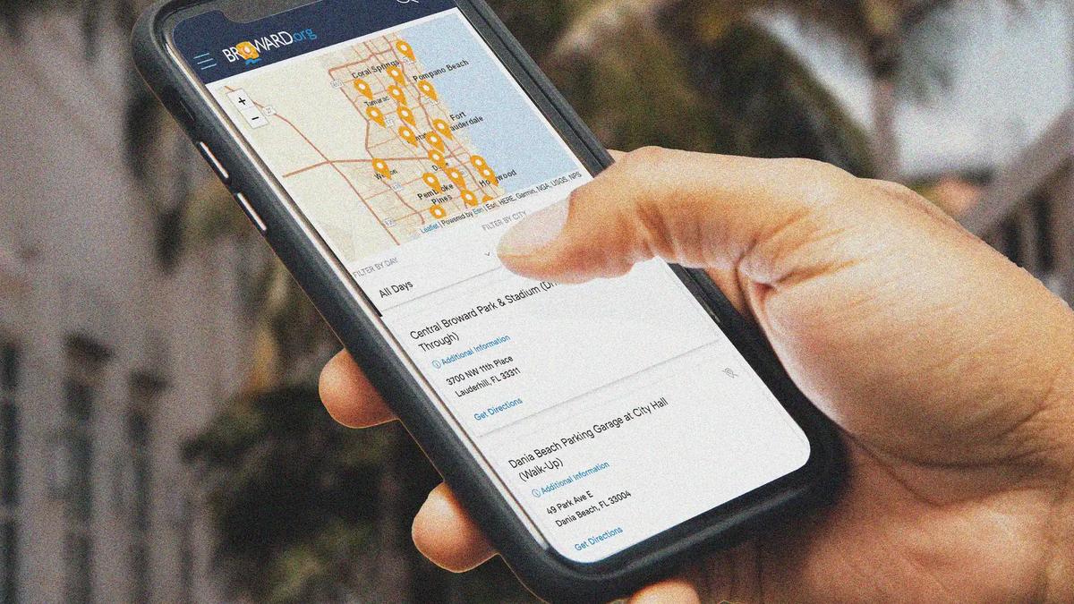
- Building a library of reusable and custom web parts for various needs ranging from event calendars to COVID test finder
- Silly online holiday games sent to the whole organization
- Performance and accessibility optimizations using Puppeteer and Lighthouse testing
- Conceptual interface designs
*There were, are and will be other issues but I have chose to focus this case study on the process towards understanding and fixing the issue of information architecture and some of its implications.